Brand Design
& Art Direction
Ideas that hold. Visual systems that scale.
Built for impact, executed for consistency.

About
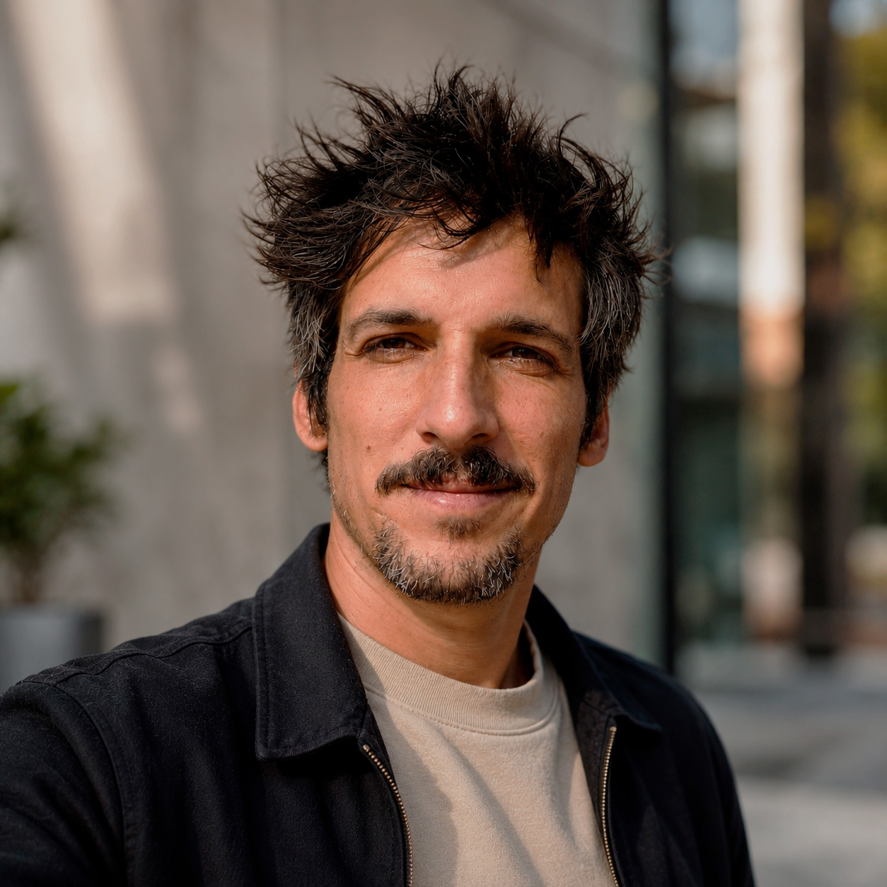
I'm Pablo, a Senior Brand Designer & Art Director with 12+ years building brand identity systems and scalable visual frameworks across FMCG, banking, telecoms, and international development.
I grew up in advertising creative leadership at VCCP Spain, where I supervised a team of 7 on brands such as Banco Santander, Microsoft, and L'Occitane, and won a Cannes Lions Bronze. Since 2020 I've worked independently for brands such as O2 and Transitions, and in 2023 I co-founded Aidporter, a design studio that turns complex information into clear visual systems for international development.
Spanish tax resident (EU), working remotely across time zones. Open to remote roles with international teams, hybrid in Madrid, freelance, or contract.
What I do
Brand identity & visual systems · Design systems · Brand guidelines · Art direction · Campaign visual systems · Multi-format rollouts · Presentation & editorial design · Information design · Generative AI workflows
Selected experience
Brand identity systems, visual communication, and information design for international development consultancies including GOPA and IBF, with projects linked to the European Investment Bank and the World Bank.
Brand identity, rebranding, and scalable visual systems for agencies, startups, and global brands including O2 and Transitions, across digital, OOH, social, and presentation environments.
Integrated campaigns across banking, telecoms, and FMCG. Supervised a creative team of 7 and 10+ pitches. Selected clients and pitches: Banco Santander, Cervezas San Miguel, Microsoft, L'Occitane.
Campaign development and visual identity work across digital, print, and broadcast for national and international consumer brands. Banco Santander Formula Rock: 21M+ people, 7 markets, Bronze Lion at Cannes Lions.
O2 Spain · Campaign Visual System · Brand Continuity
Brand continuity under pressure. No new assets. No extra time.
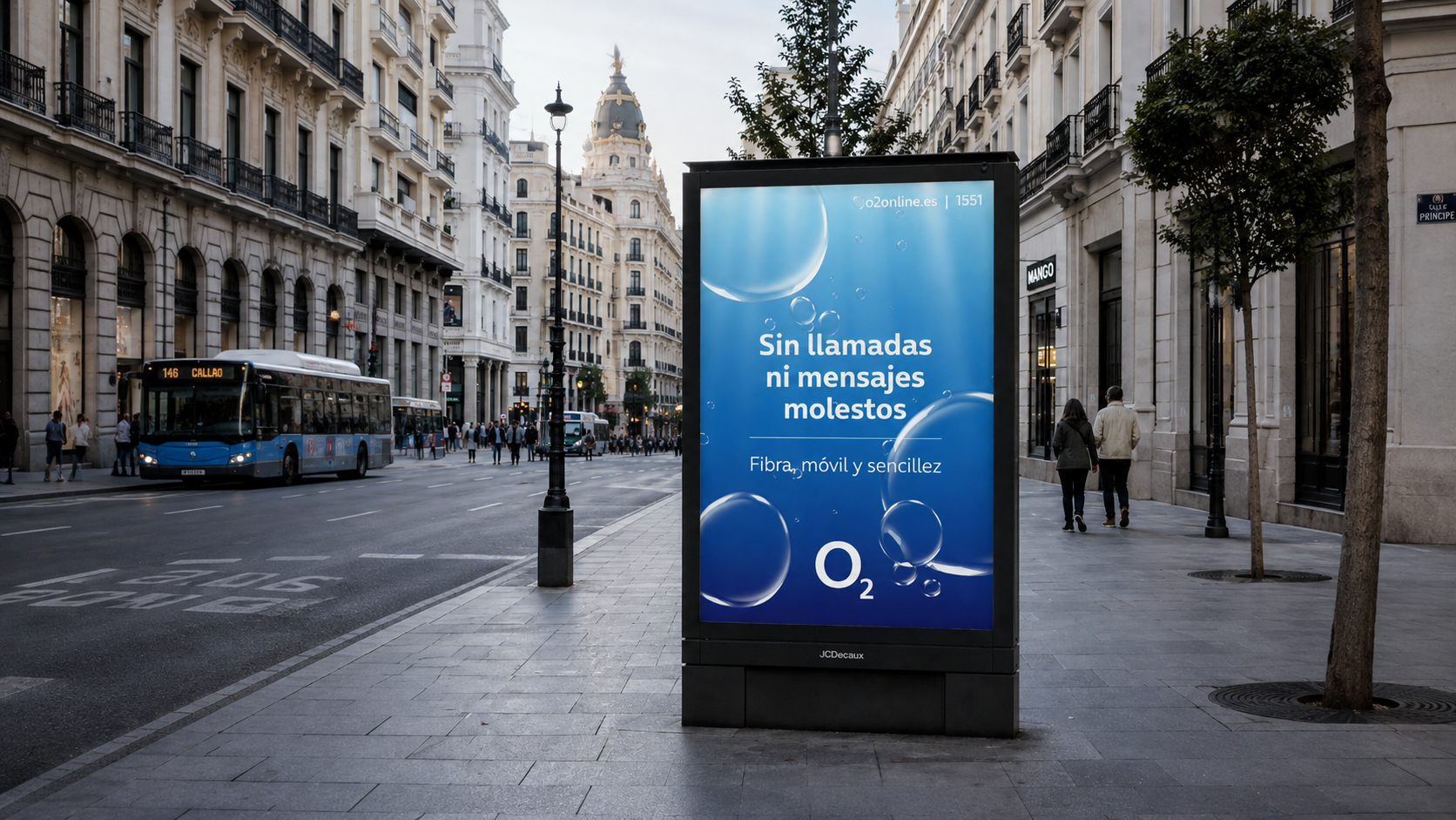
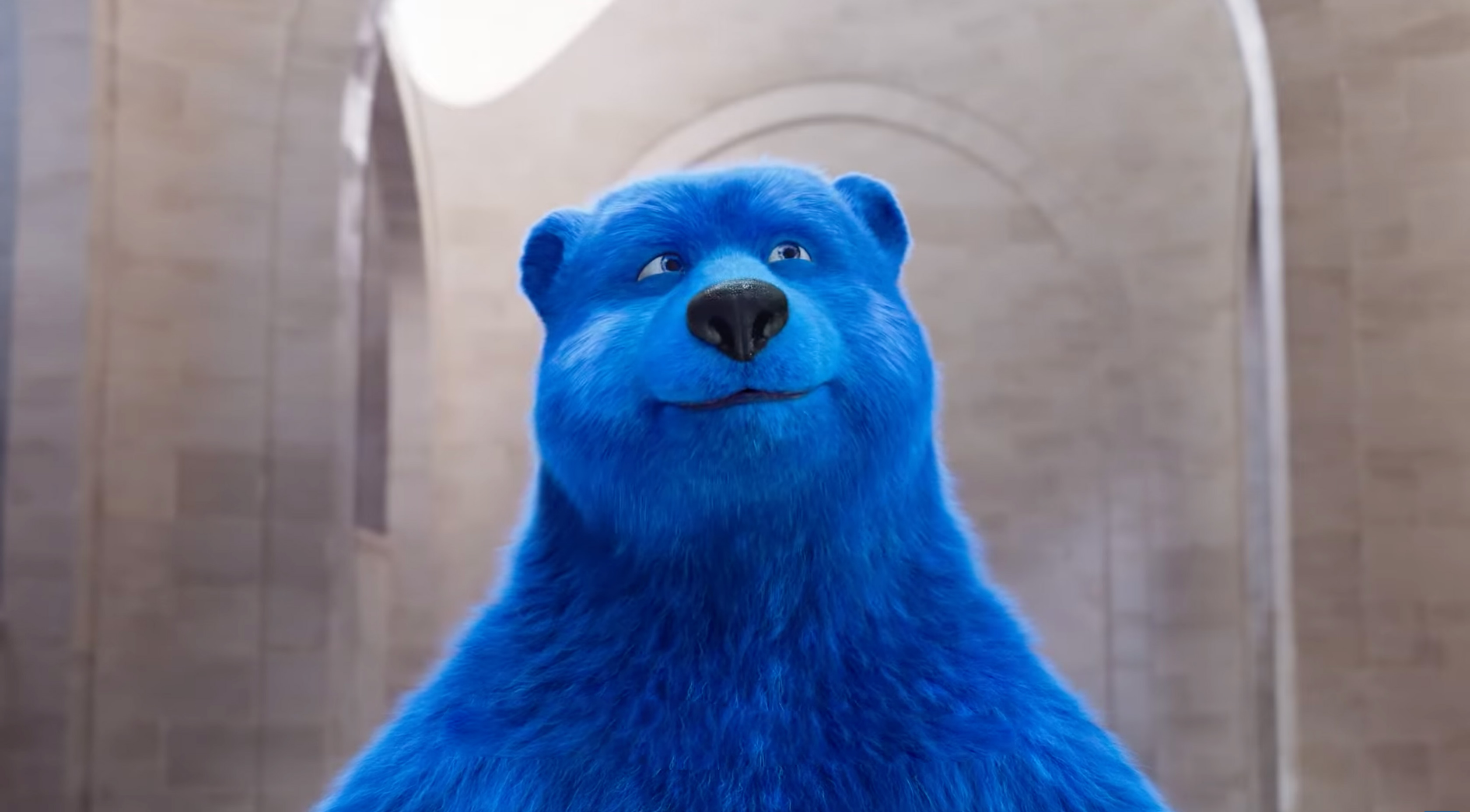
Two distinct visual worlds.
No transition planned.
No time to create one.
O2 Spain had a fully contracted media plan ready to run when their incoming Marketing Director decided not to use the existing campaign. The replacement, built around a new brand character above the surface for the first time in the brand's history, was still stuck in unfinished CGI production. With the media plan already paid for and nothing to run on it, they brought in an outside designer to find the way out.
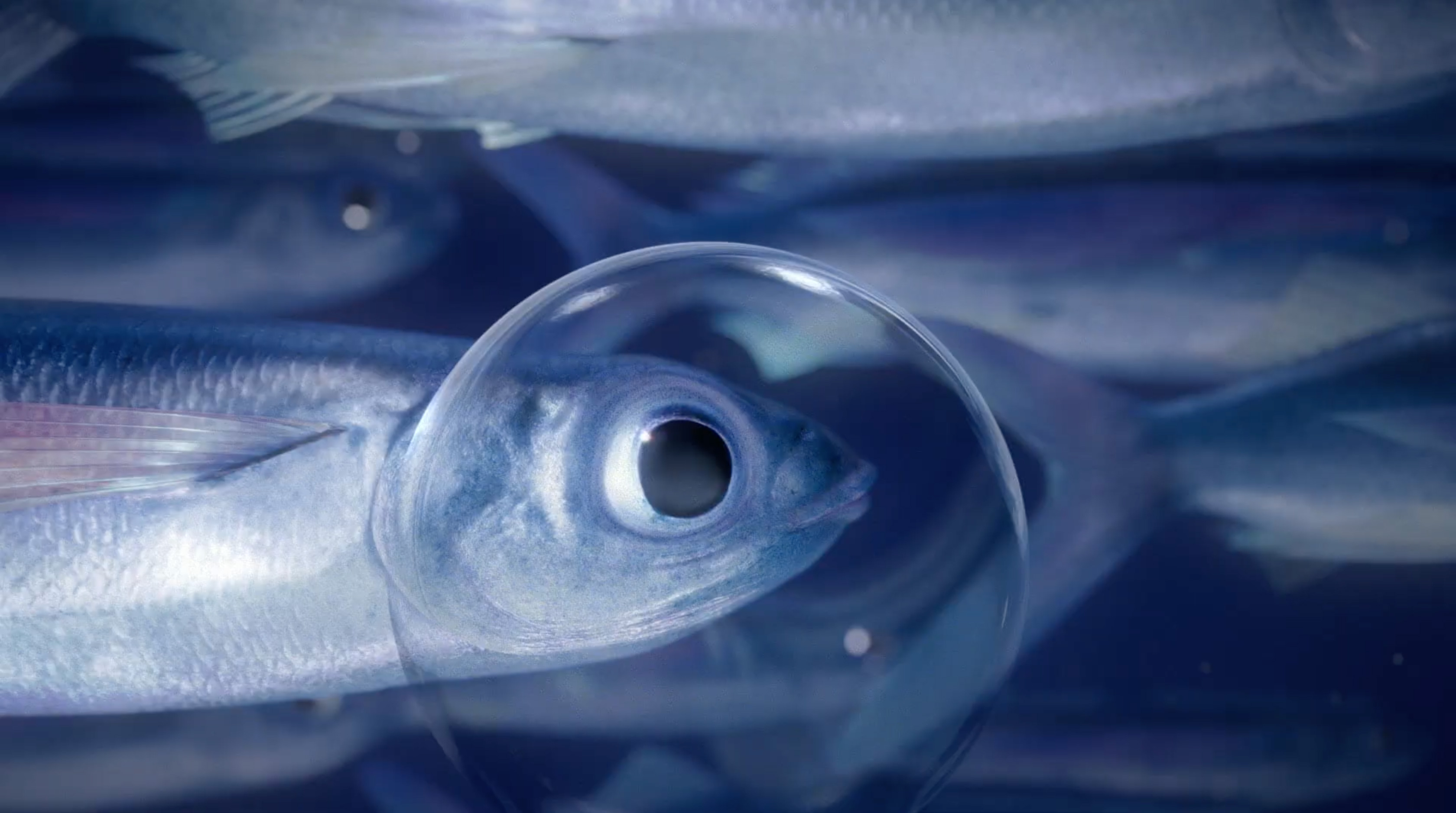
Follow the bubbles
to the surface.
I went looking inside the brand's own history, and the answer was already there. O2's bubbles had been present across every campaign, underwater and above. They belonged to neither world exclusively, which made them the only element that could bridge both.
Three decisions built the entire system.
01 — 03{{ d.body }}
Built to be handed off. One library. Unlimited formats.
Every format in this campaign was produced from the same six layers: the gradient, the light plate, the bubble components, the headline, the mark and the contact line. Nothing was scaled from another format. Each piece is built at its own size, from rules that read the frame.
The library was built with one constraint in mind: any designer should be able to open this file, meet a format nobody anticipated, and produce it correctly without asking a single question.
Seven sheets. Every decision, written down.
Click to expand · 01 — 07{{ m.caption }}
Every surface, every ratio.
One system underneath.
No format was ever cropped out of a master. Every size is redrawn from the same layers, so the full range is present at 4:1 and at 9:16 alike.
Continuity without
compromise.
40+ formats out of one library, 3 weeks from brief to the first site live, and 100% of the contracted media plan on schedule
with 0 new shoots. The bubbles bridged two creative eras without belonging to either, because they had always belonged to both.
Transitions Gen S · Global Campaign Visual System
Repositioning from functional optical product to global lifestyle brand.
A life in motion.
One lens. Every version of you.
Transitions Gen S had a problem that design needed to solve: only 1 in 10 eyeglasses wearers chooses dynamic lenses, and spontaneous brand awareness sat at 3%. The product was technically superior. The brand was invisible. The concept came fixed from the client, Life changes in a moment, and the job was to turn it into a visual system that could travel across markets, formats and cultures without losing its core logic.
You, in every light.
The brief kept returning to one idea: these lenses don't replace your glasses. They replace all your glasses. Every pair you'd need for every moment of your day condensed into one.
That's not a product feature. That's a visual brief. One person crosses three lights in a single day, and the lens meets each one differently. Not three people, not three styles: the same face in three moments.
Showing them side by side is documentation. Showing them at once is the idea. That's where the echo print came from.
Where product logic becomes visual language.
One idea is not a system until it survives other hands. The echo print had to work when a retail team in São Paulo cropped it, when a media agency in Tokyo animated it, and when a designer who never heard the pitch built a new format from it. So the idea was reduced to four constants: fixed, named, and non-negotiable. Everything else stays free.
The entire campaign was built on four visual constants, and every piece from five named layers — plate, gradient, photography, veil, floor — each with one owner and one rule.
Four visual constants.
Click to expand · 01 — 04{{ m.caption }}
Designed to scale. Built to travel. One library. Every format. Every market.
Every format in this campaign was produced from the same component library, built so a market never has to come back and ask. I designed the foundations, the echo print and the component logic; the Madrid, London and New York teams extended it into full execution under that direction.
One library, four moving parts.
Click to expand · 01 — 04{{ m.caption }}
One system. Every touchpoint.
OOH · Social · Display · Web · CRM
Shown here: the image layer of the system, before brand, copy and product are set per market.
Three offices signed
the same signature.
One echo print, four visual constants and a component library that three offices could open and build from. I designed the system end to end as a freelance lead; the Madrid, London and New York teams carried it into full execution under that direction, and the global pitch was won with it. Several visual elements, like the background cloud textures, were generated with AI (ChatGPT) and then art directed into the system’s rules.
← Back to workThis project is being revised.
I'm rebuilding this case study as part of a wider portfolio update. The page below shows its structure and narrative, while the final artwork is being prepared for publication.
The full campaign material is available on request.
L'Occitane · Global Brand Repositioning · Campaign Pitch
Repositioning a heritage house for the way beauty is understood today.
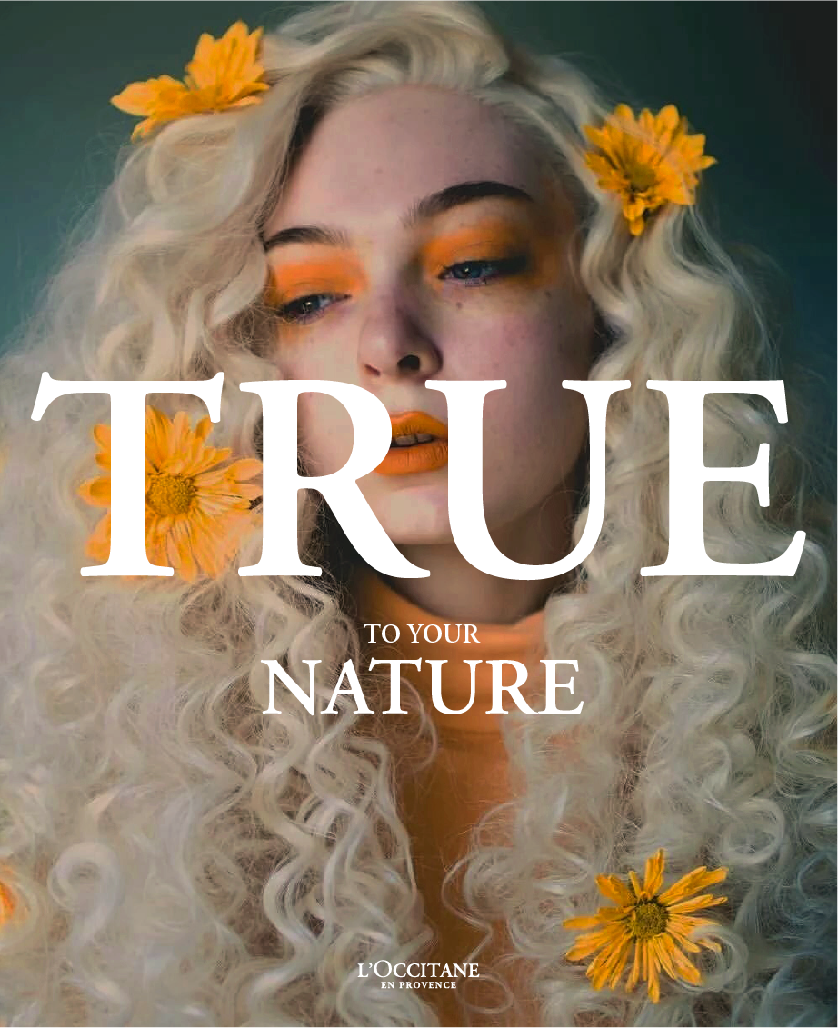
True to your nature.
A repositioning built on one line, strong enough to hold the brand and flexible enough to become five.
Each pillar gets its own campaign, and the brand still speaks with one voice.
Beauty is plural.
The casting had
to prove it first.
A concept about plural beauty is only as honest as the people in the frame. So the casting came before the copy: ages, skins and identities lit the same way, held the same length of time, with nothing specific about anyone smoothed out on the way to the page.
Which is how a heritage cosmetics house ended up looking at Miss Fame. Artist, make-up authority, drag queen, and the only face in the deck that made the idea impossible to read as a slogan.
One line.
Five pillars.
Endless combinations.
Each pillar takes the line and answers it differently: ingredients argue with provenance, products with the range, traditions with process, values with people, customers with their own faces.
They are not five separate stories but one idea recombined. Any pillar can pair with any face, any format and any market, and the lock-up holds it together every time.
{{ loccCurrentName }}
{{ loccCounter }}Every market, every format.
One idea that never bends.
Nothing is redrawn per channel. The composition rules decide where the line sits, so any market can add a format without asking.
Four offices.
One concept.
The proposal was built jointly across VCCP Madrid, London, Sydney and New York. I led the art direction and, with my copy partner, created the creative concept: one line, five pillars, and a casting brief brave enough to make a heritage house look like the world it sells to.
← Back to workMicrosoft · Windows 10 Launch · Outdoor Campaign
Turning a software launch into a story about the windows history looked through.
Nobody gets excited
about an operating
system.
A new Windows arrives with a feature list, and a feature list is not a reason to care. The launch needed something people would stop for that had nothing to do with specifications.
The answer was sitting in the name. A window is not a product: it is what you look through when something worth seeing happens on the other side. Windows that upgrade the world.
Windows that
upgrade the world.
Every moment worth remembering was watched from somewhere.
The film borrowed the windows of the world; the street borrowed the windows of Spain.
Lean in, and history
is still happening
on the other side.
Each scene was cut into planes and moved at different speeds, so the image behaves like something seen through glass rather than a photograph pushed across the screen.
It also solved a real problem. Historic footage is scarce, low resolution and rights heavy. Building the moments as layered stills let the campaign travel anywhere without a single frame of licensed film.
Outdoor in Spain.
A film for the world.
An outdoor campaign on historic windows across Spain,
and a case study that opened the same idea onto the windows of the world.
A product launch builtto keep history going.
Created at VCCP Spain for the Windows 10 launch. I led the art direction of the outdoor campaign and its case study,
and took on the craft myself: the parallax animation and the sound design that gave every window its depth.
San Miguel · Casa San Miguel Ibiza · Brand Experience
An island, three artists and a brand that had to be lived, not advertised.
Every beer brand
claims the summer.
None of them lends it.
San Miguel needed to matter to people across its international markets, in a category where everyone films the same terrace at the same golden hour and calls it summer.
So instead of advertising an experience, the brand gave one away: something people had to enter for, and that only a few would actually live.
Made of experiences.
Ibiza reinterpreted through the eyes, ears and taste of three artists with a real bond to the island.
Not a campaign about the island. Four weekends on it, with the brand as the host.
A village called
San Miguel, turned
into the brand's house.
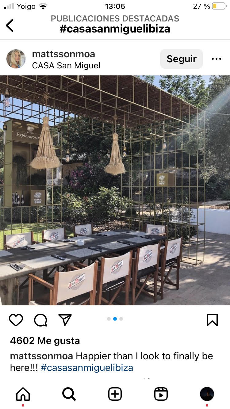
The village of San Miguel in Ibiza shares the brand's name, so it became the venue: a house where urban art, gastronomy and music ran across four weekends of the summer.
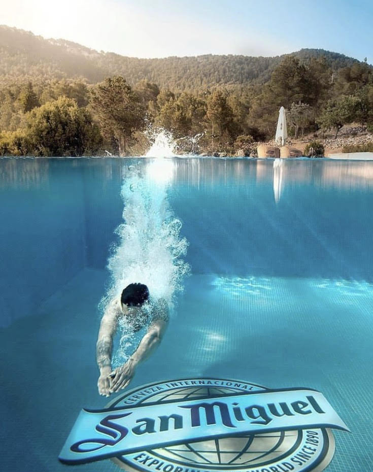
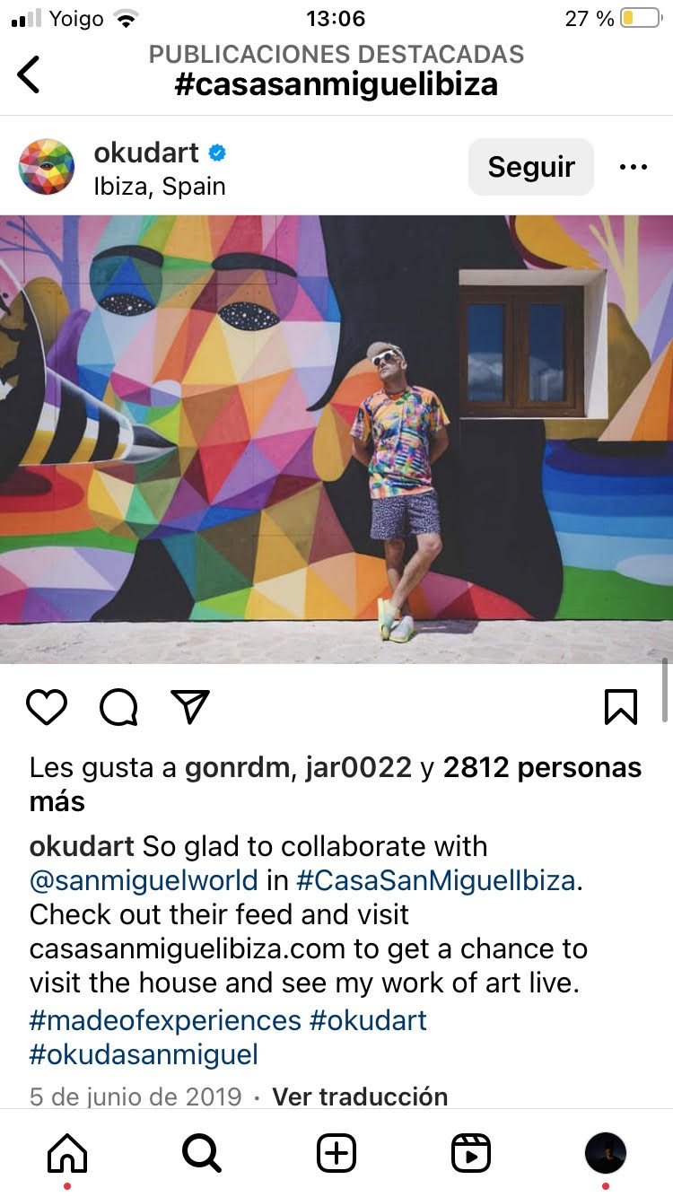
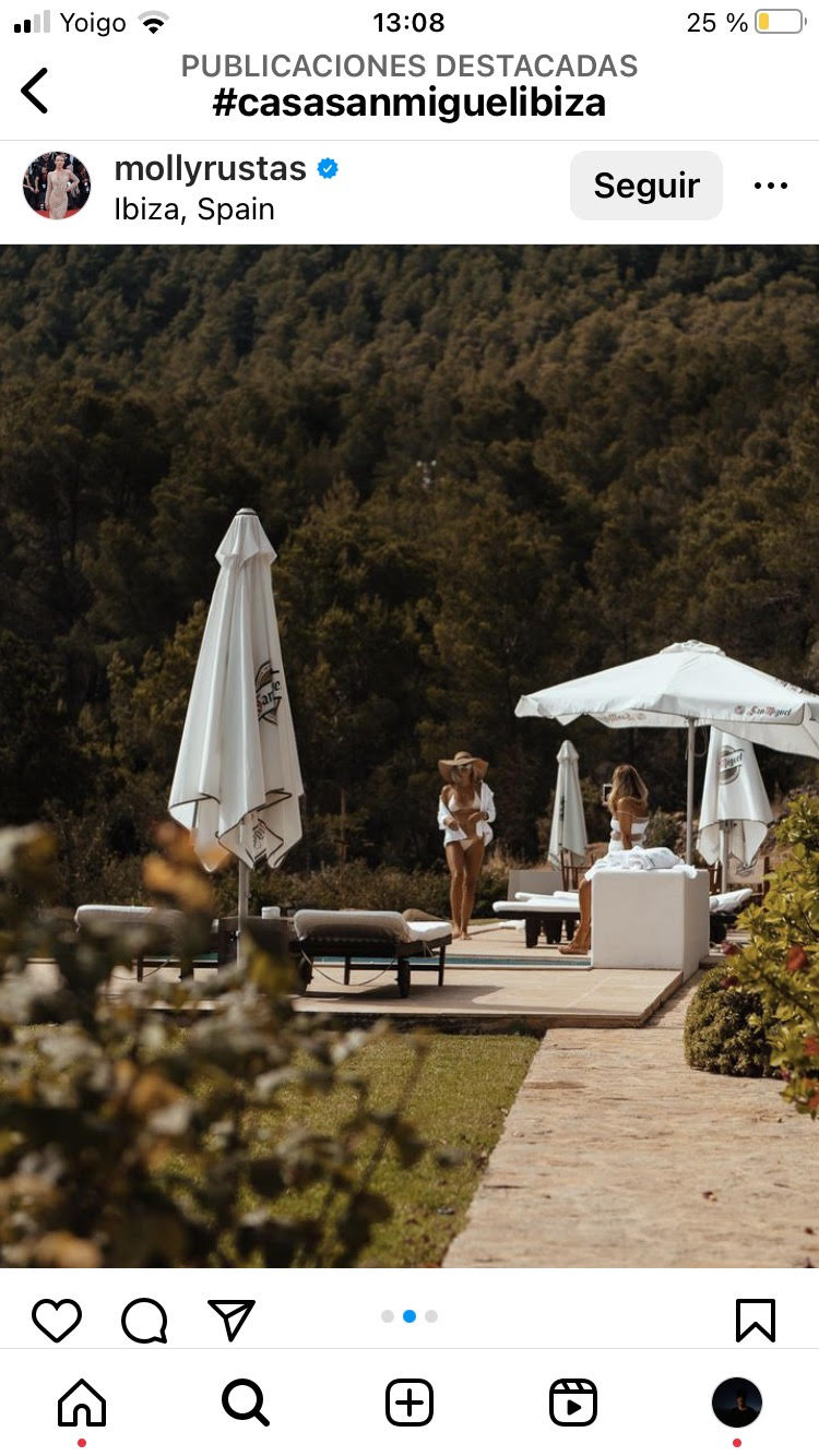
Every detail was designed as content in waiting, from the mural on the wall to the logo on the floor of the infinity pool.
Three ways to read
the same island.
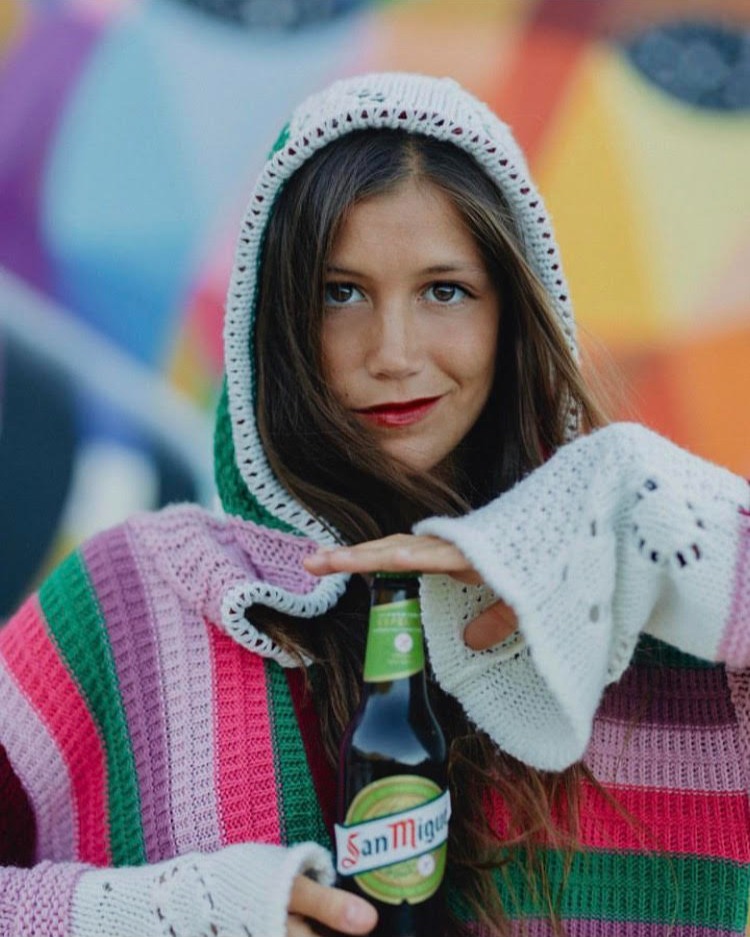
Okuda painted it, Ohm-G scored it and Basilio Corral cooked it. Each one hosted a piece of the house
and each one carried the campaign in their own feed afterwards.
A globally collected muralist whose surname the brand already carried. He painted the house, and the island kept the wall.
A resident who has read this island for years. He set the tempo of every weekend, from the sea at six to the last record of the night.
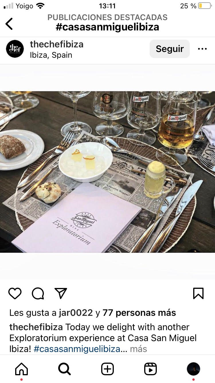
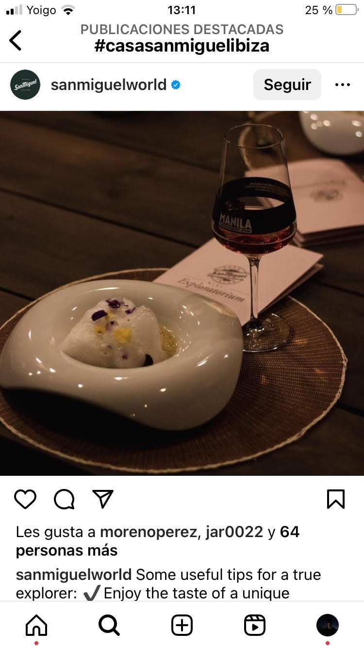
The local chef who cooks what the island grows. He wrote a menu that could only be paired with one thing, and poured it himself.
Casa San Miguel, Ibiza.
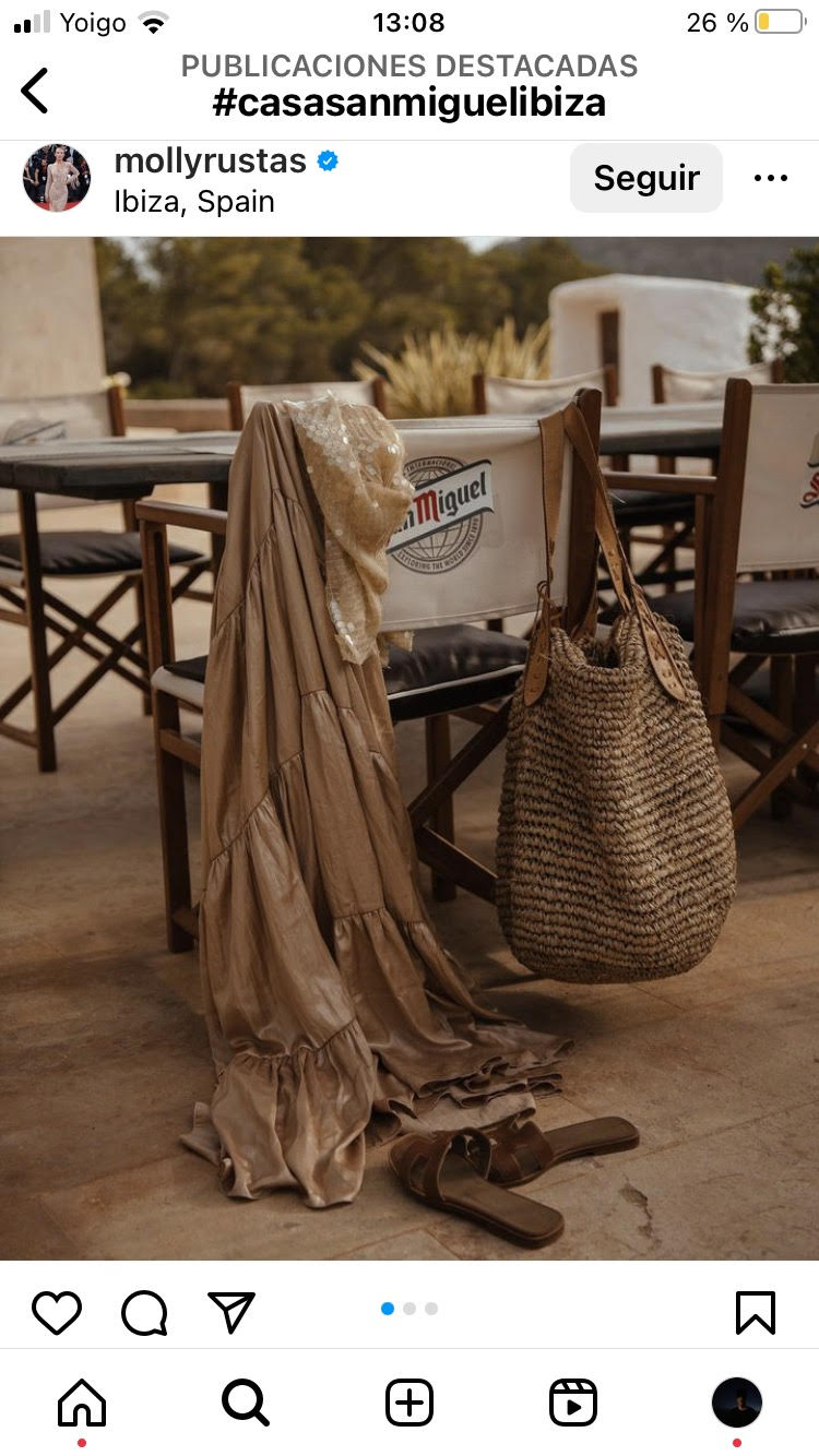
Event · influencers · socialA house intervened by Okuda San Miguel, a menu designed by local chef Basilio Corral and every weekend mixed by Ohm-G, the island’s resident DJ. The invitations were won, not handed out: content and social sent people to casasanmiguelibiza.com to enter for a place at one of the weekends. Influencers from San Miguel’s key international markets came too, and published it from the inside.
The best media plan
was the guest list.
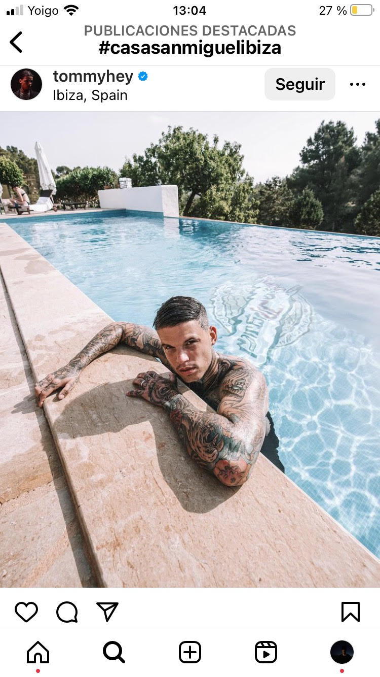
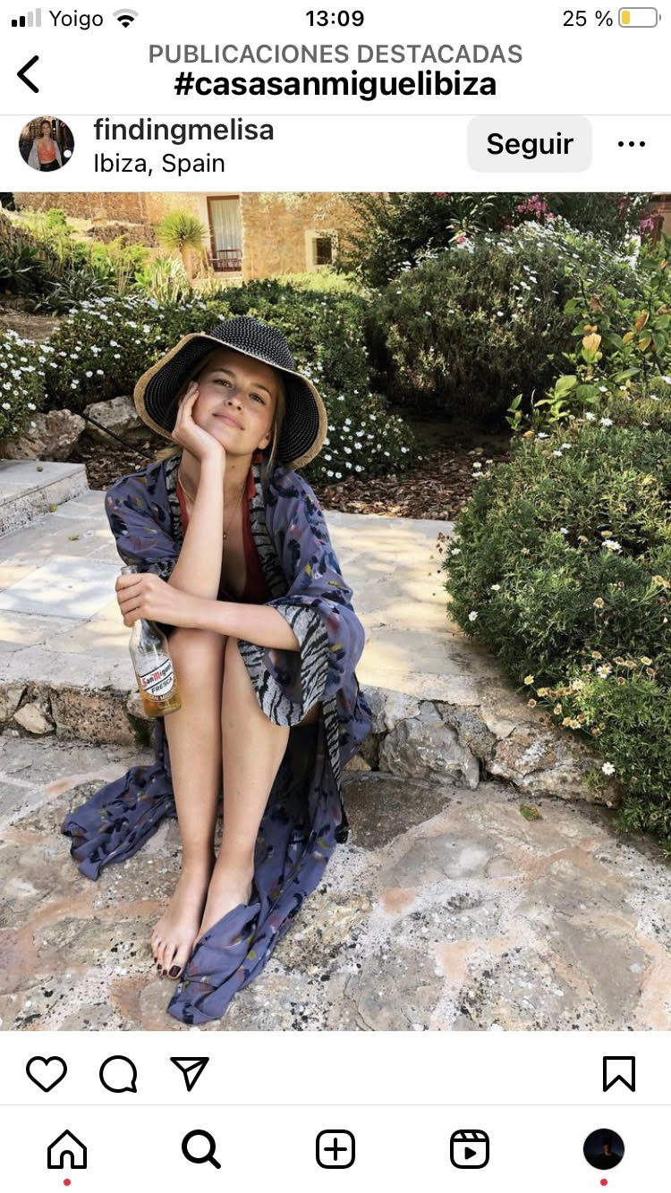
38 creators, 5 international markets and 30 million impressions across four weekends of one summer,
most of it published by people who were not being paid to post.
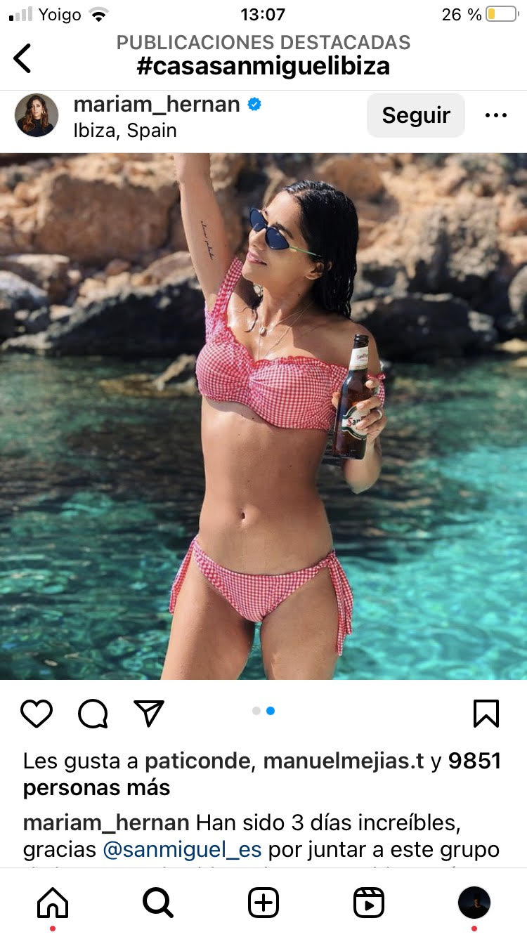
The prize was
the campaign.
Content and social drove people to casasanmiguelibiza.com, where an invitation to one of the weekends was the thing to win.
Created at VCCP Spain with Nephilim on production. I designed and conceptualised the event, and led the art direction of every asset.
Banco Santander · Scuderia Ferrari · Campaign Platform
A sponsorship everyone could see and nobody could explain.
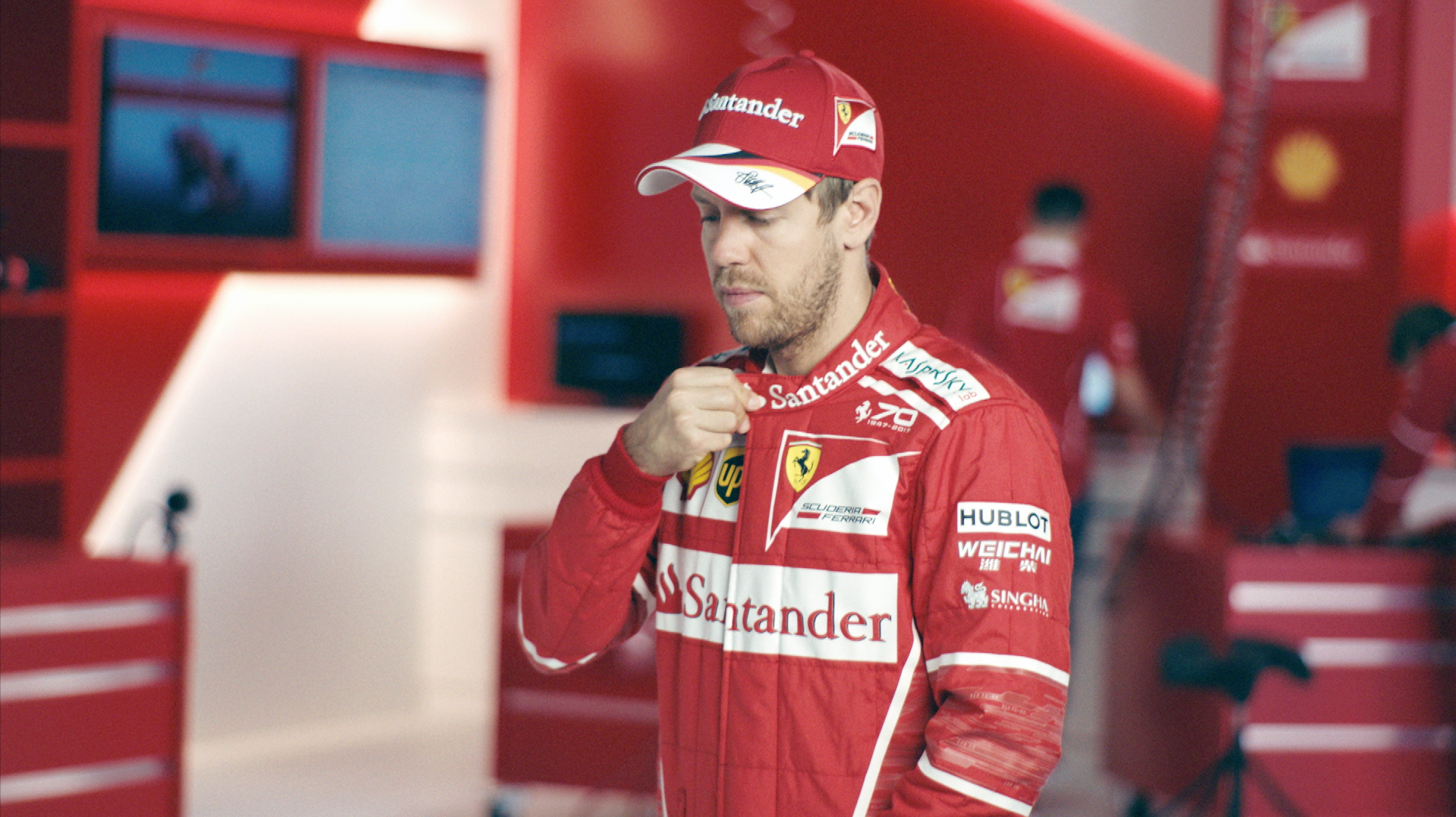
Driving with you.
Banco Santander had been on the Scuderia Ferrari car since 2017, highly visible and saying nothing about the bank. What a bank and a racing team actually share is not speed: it is that nobody crosses the line alone. A domino effect, where the push is never the driver and one thing makes the next one possible. Three films, same chain, three lengths.
Two hours each.
Two world champions.
No second take.
Vettel and Räikkönen were available for two hours each, mid-season, and neither of them is an actor. The films had to be written for that window, not squeezed into it afterwards.
One setup, pre-rigged, shot list locked, running order fixed. They walked in, delivered one line each and walked out. Which forced a better decision: build the story so the champion never has to carry it.
{{ santanderName }}
{{ santanderCaption }}
Formula Rock.
The sound of F1,
played on a guitar.
A social challenge inside the platform: a guitar imitates the engines through a lap, and you have to name the circuit from the sound alone. Two years of content needed something people would play with, not just watch.
Six weeks, 21 million people reached and engagement up 83%. It became the most successful social campaign in Banco Santander's history, and won a Bronze Lion in Radio at Cannes.
A platform that carried
two years of content.
Won as a creative team with my copywriter, and led for the two years that followed: he on copy, I on art,
the creative concept shared. Produced by La Joya Films with Sebastian Vettel and Kimi Räikkönen.
{{ zoomCaption }}